186 South View Path, Killington, VT was designed and built in 1969 from plans available from Better Homes and Gardens Magazine.
Interested in Renting?
A nice intro to this project is an excerpt from a 1969 write up in Better Home and Garden Magazine:
Take the charming lines of an old New England saltbox, then put a modern floor plan in the wonderful inside space.
The Result? A house as good as this one.
The exterior reveals its heritage, but the neat, up-to-date windows tell you to expect something special inside.
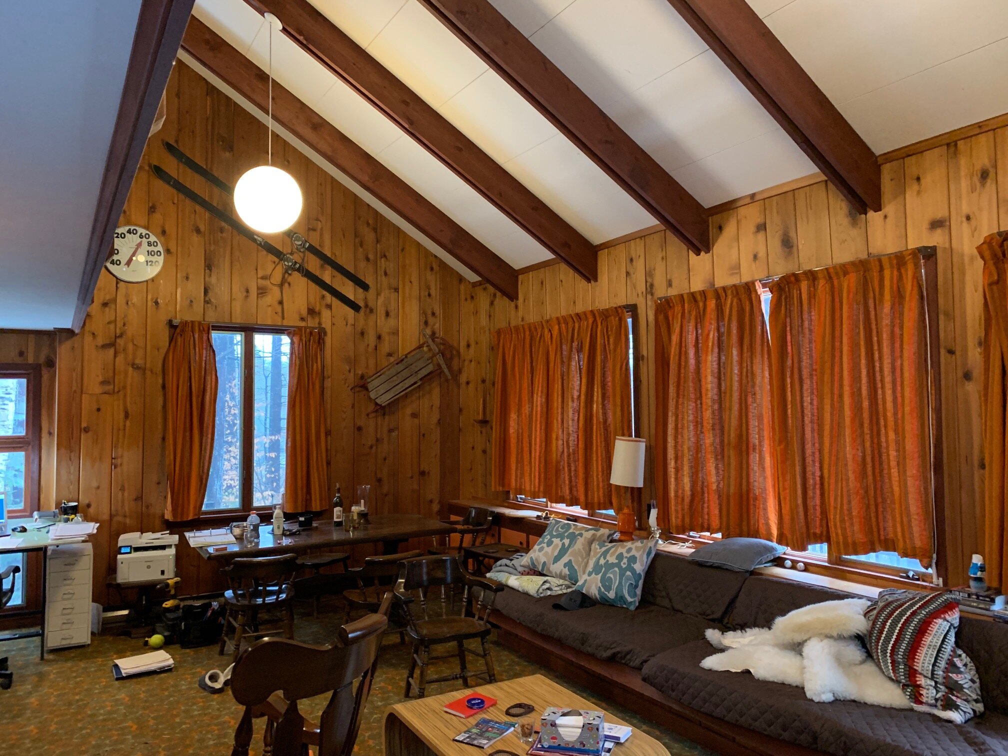
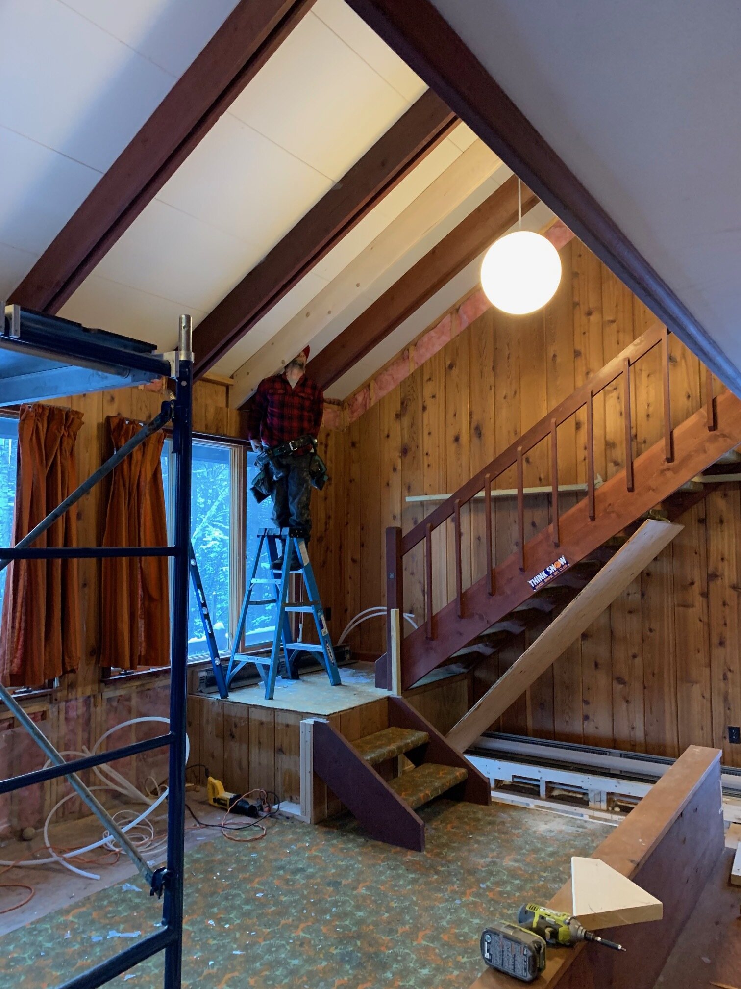
And that’s exactly what happens in the long living-dining room (left). It seems especially large because of the dramatic slope of the ceiling and the open balcony-hall above. The stairway at the far end of the room is simple, but adds a dramatic touch, too.
The plan also shows the efficient use of all the floor space. A great house for a beginning family – you could leave the upper level unfurnished and complete it later. With the single garage, dimensions are 44x32 feet. Floor space is only 816 square feet.
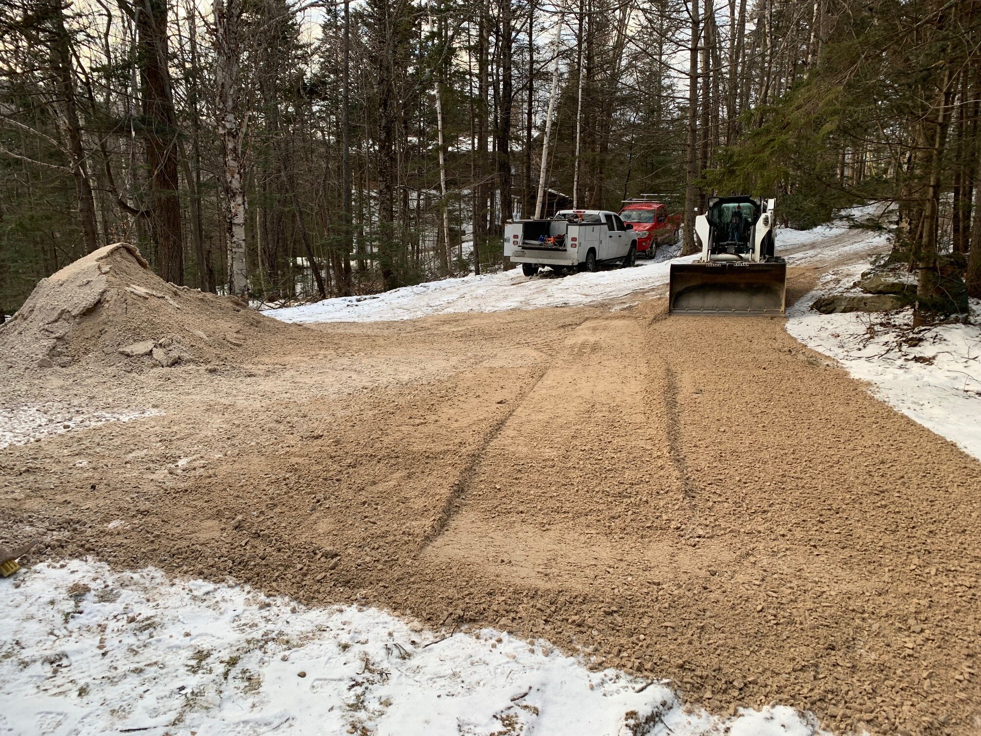
The appeal of the project was the location and the efficient envelope of the house. The property is located on a cul-de-sac in a very private and wooded setting. However, the short length of South View Path, which is right off the Killington access road, allows for a quick 15-minute walk to the restaurants and night clubs or a 10-minute drive to the ski resort in the morning.
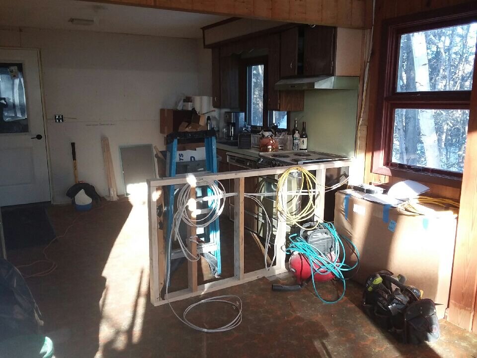
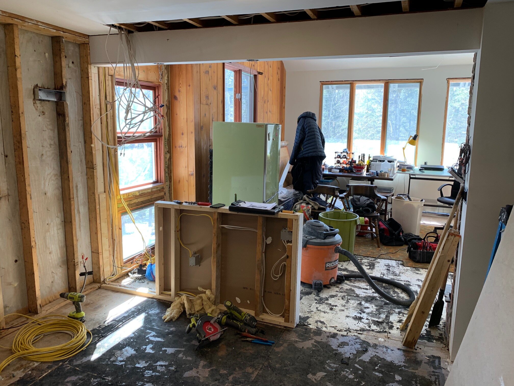
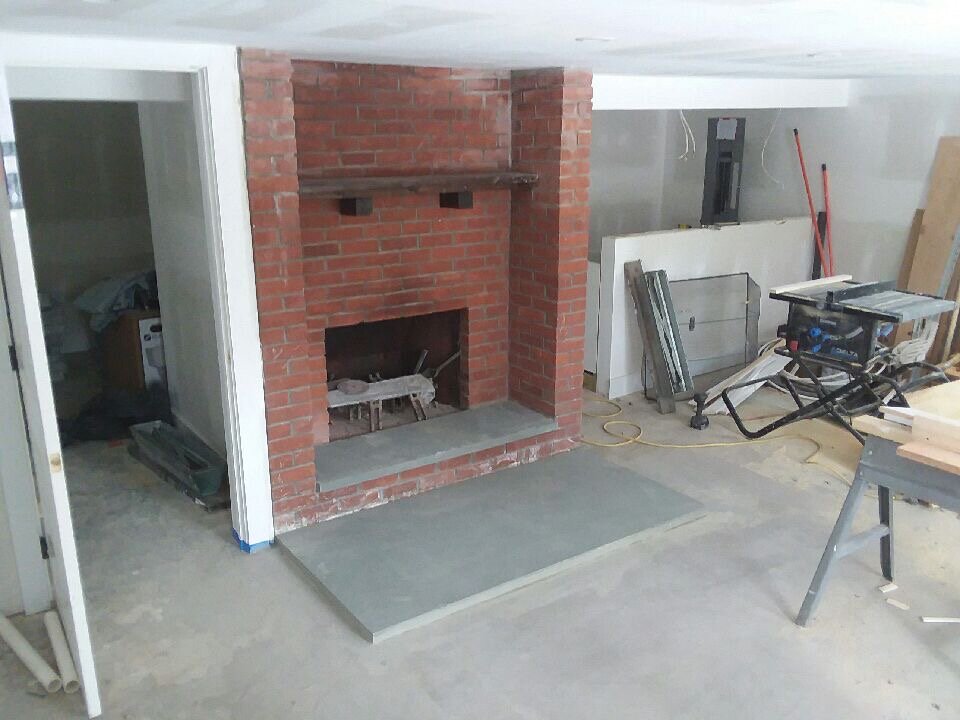
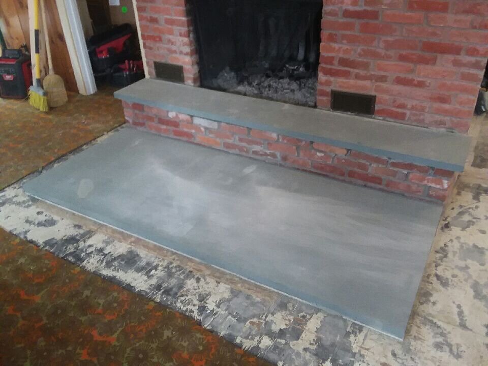
Before & After
The Construction Process
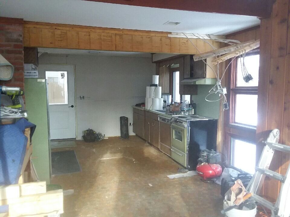
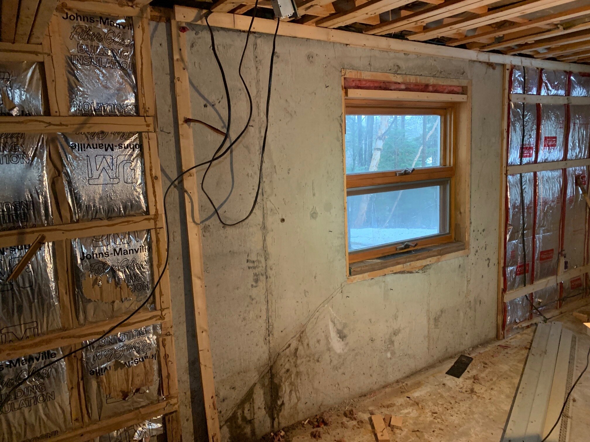
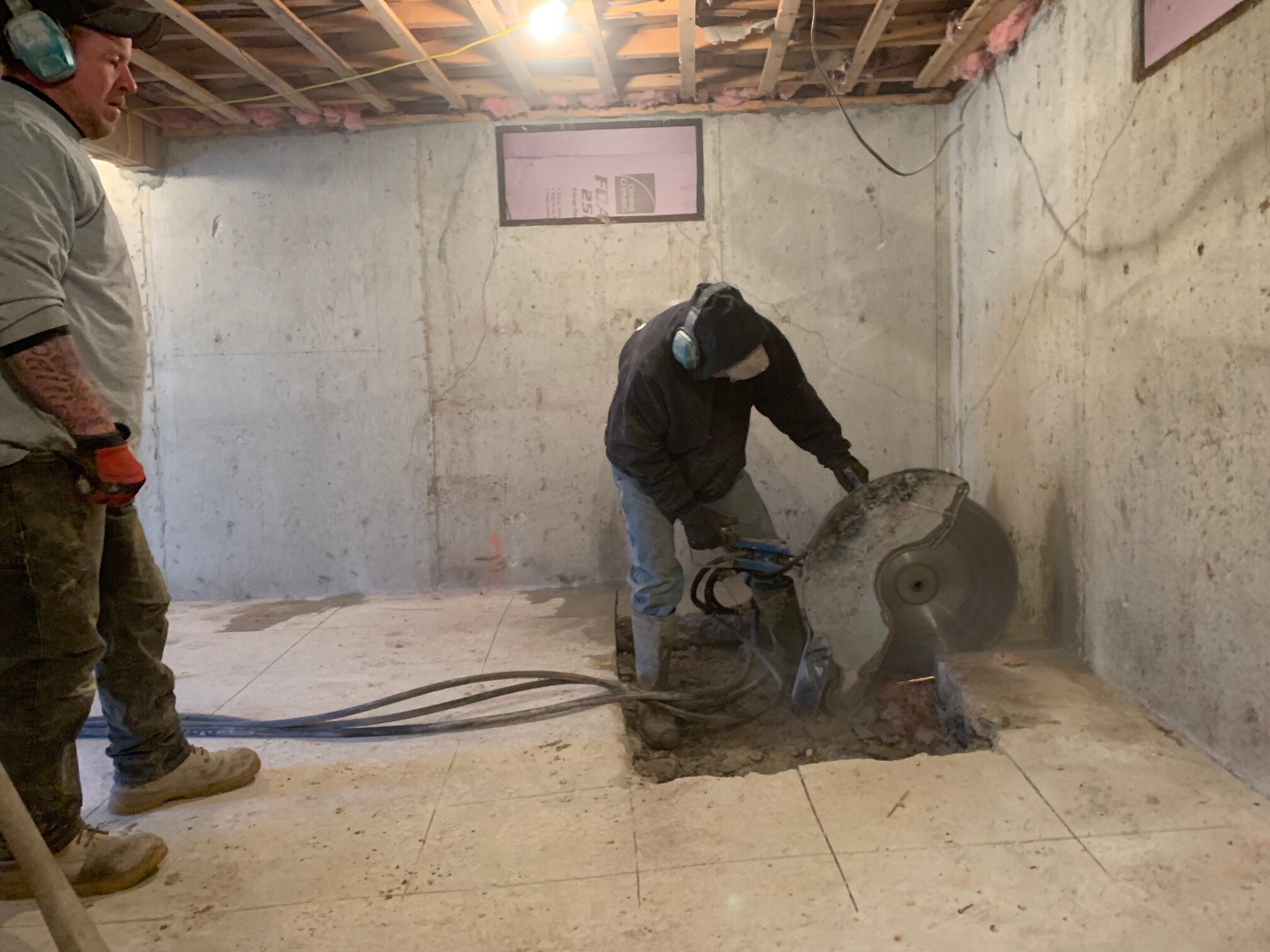
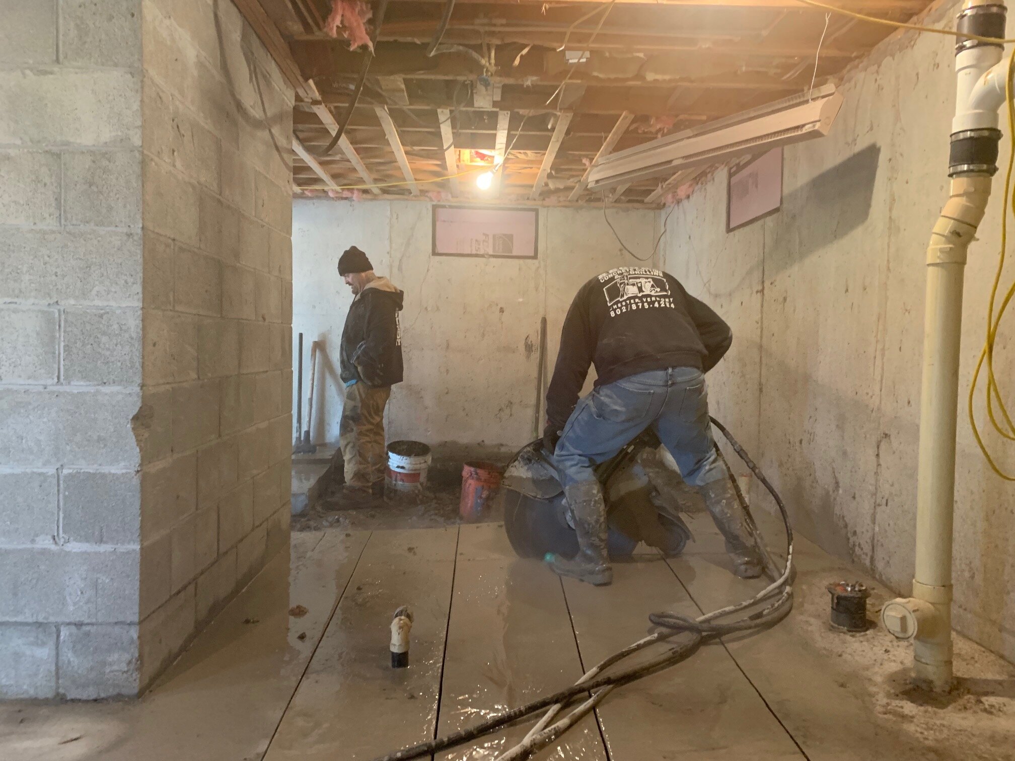
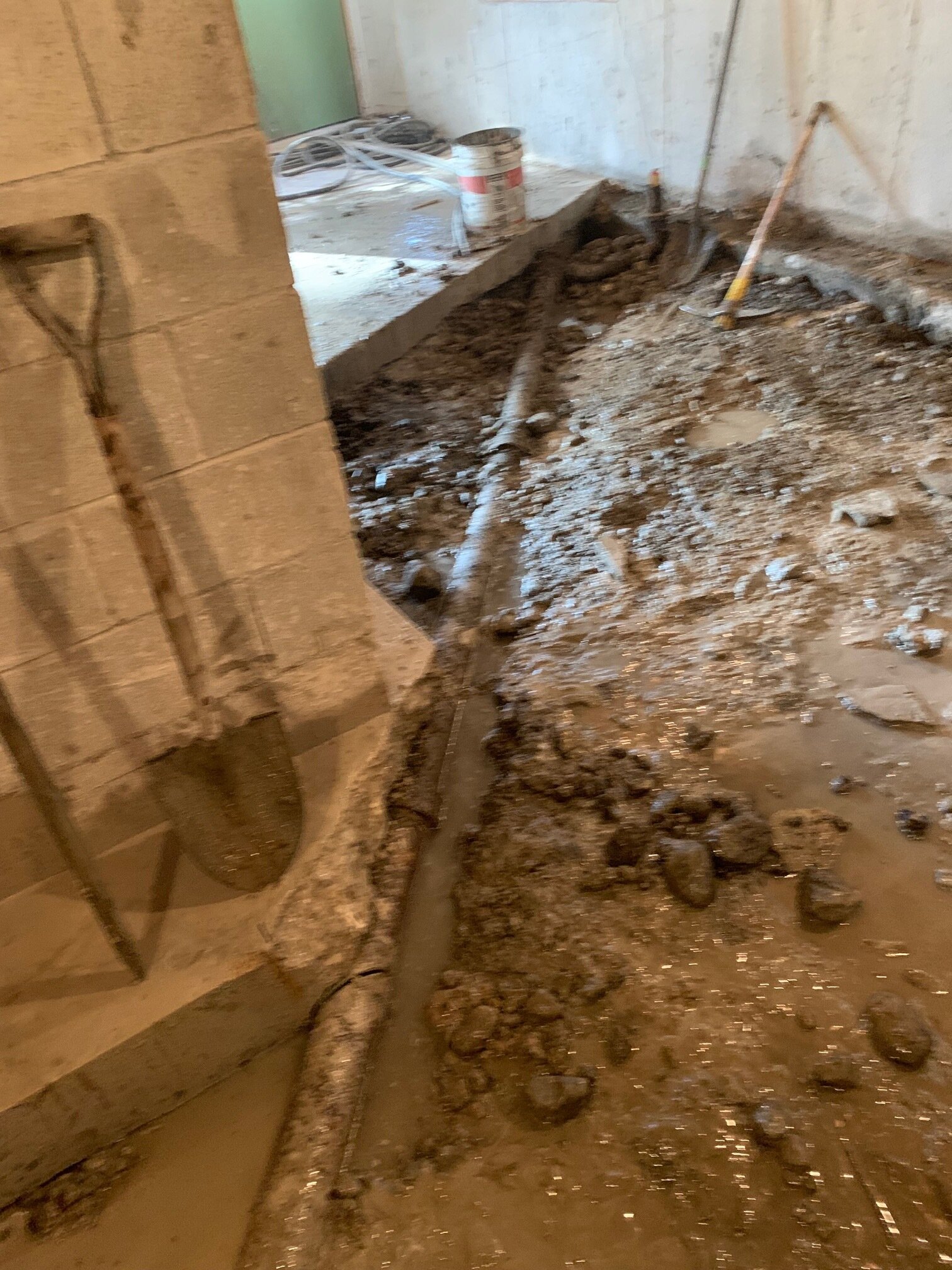
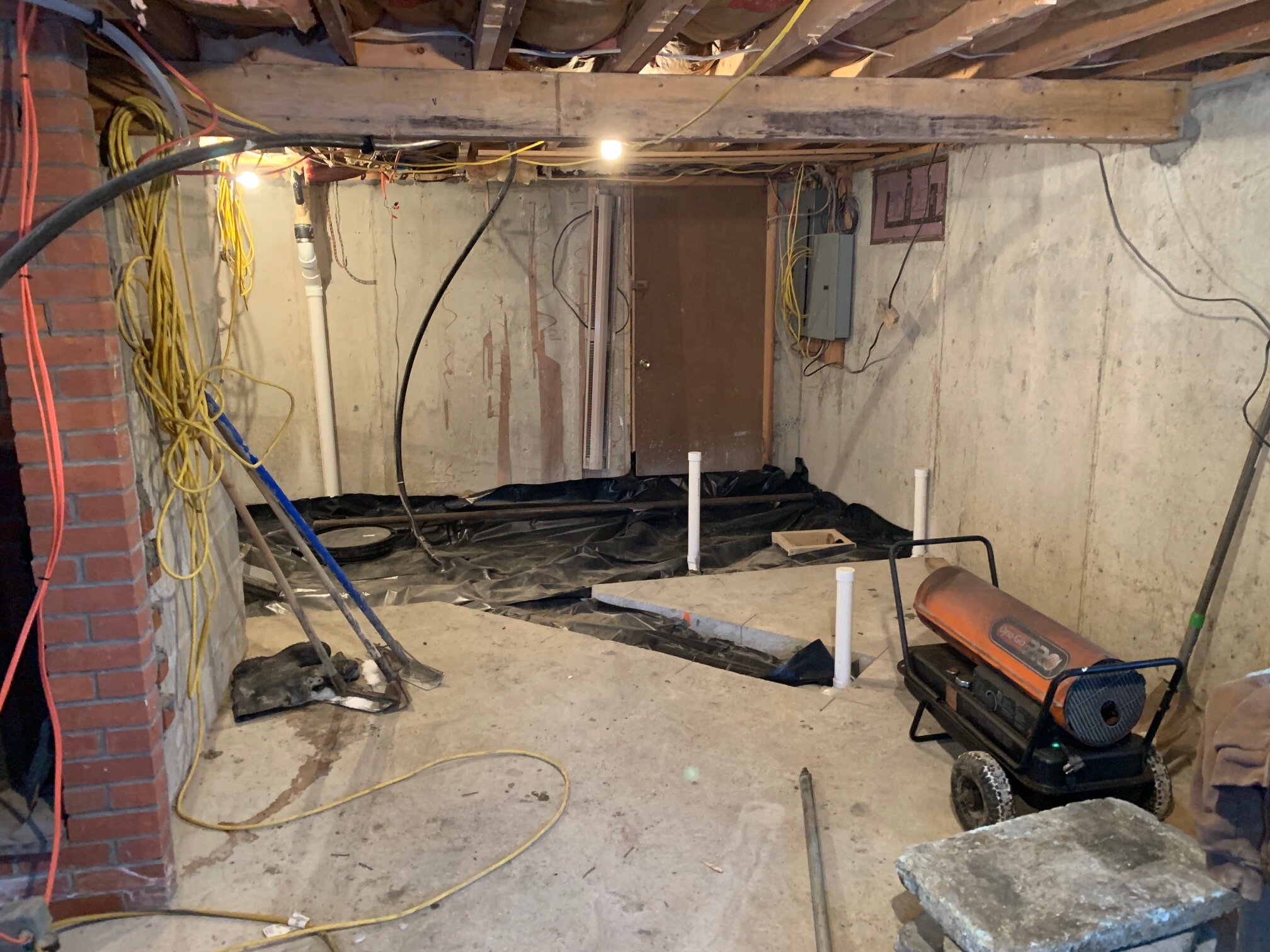
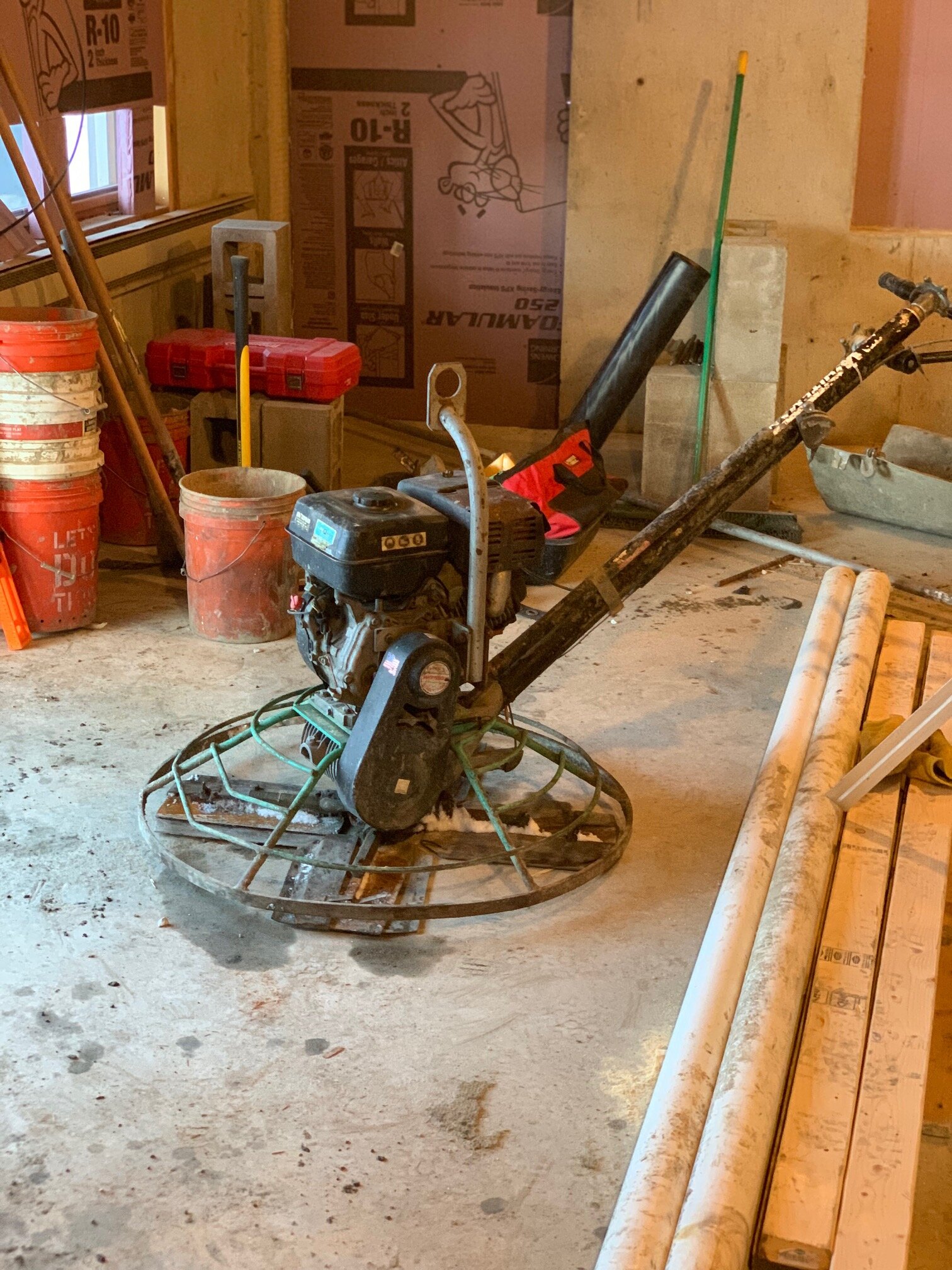
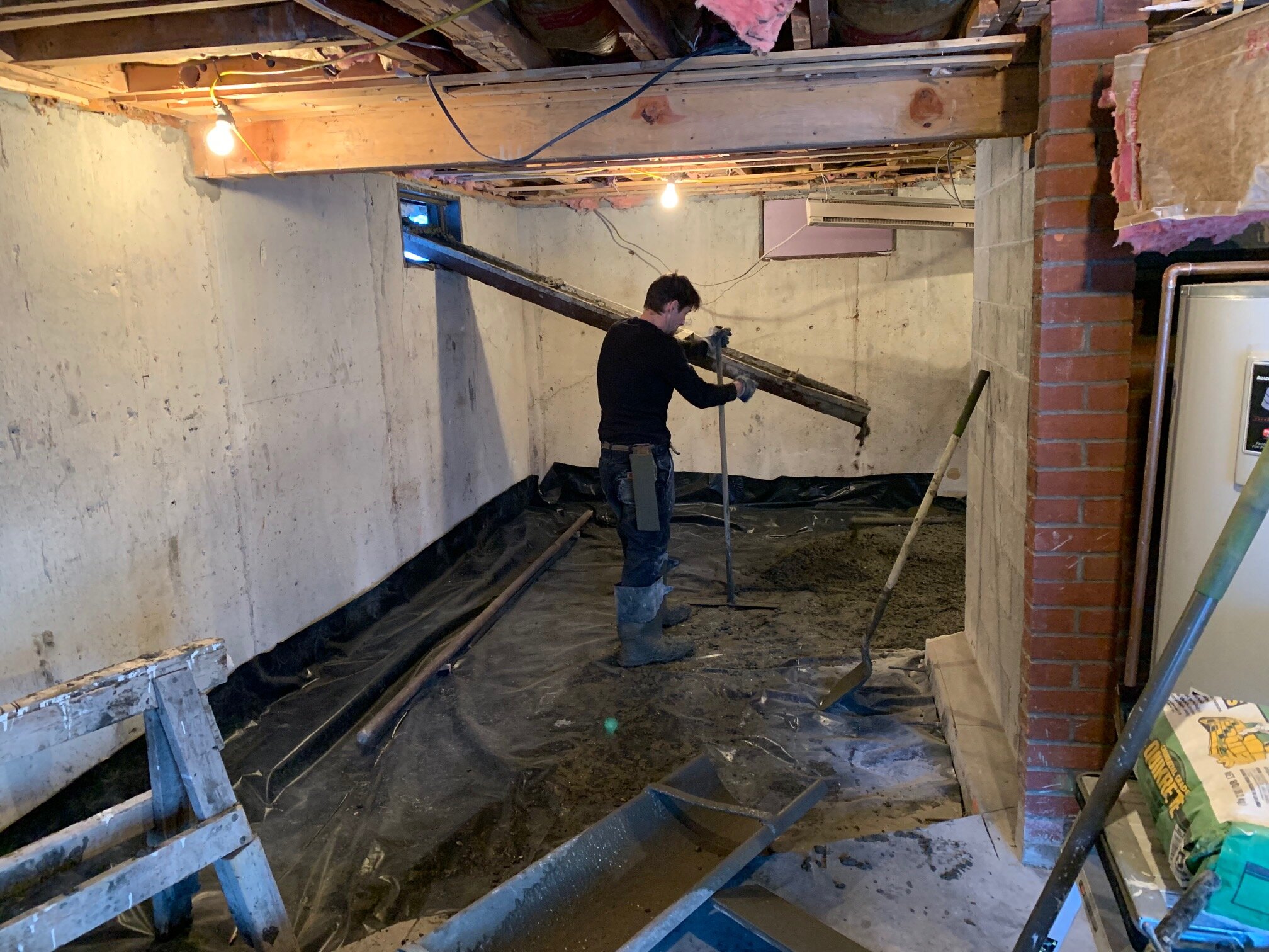
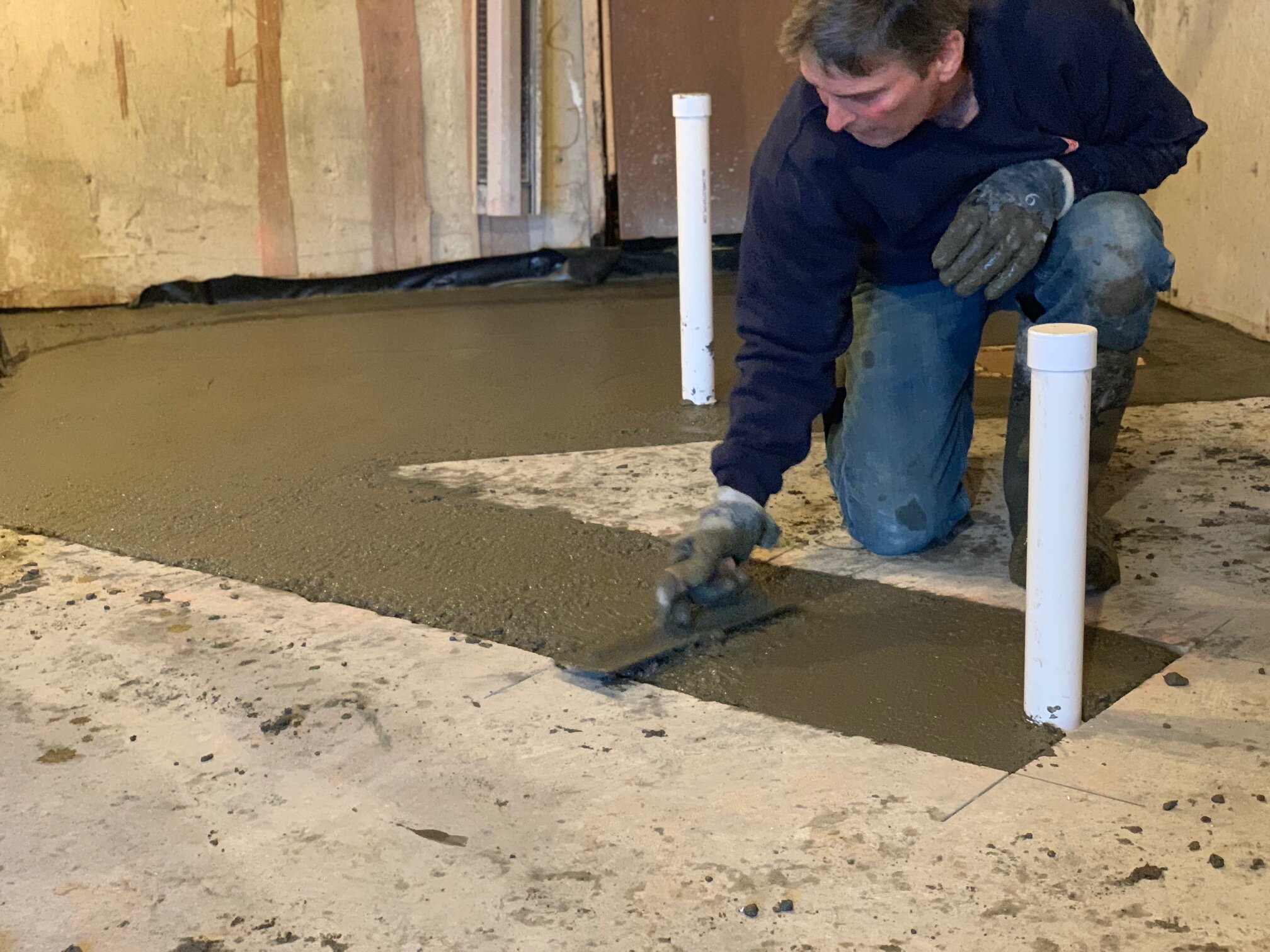
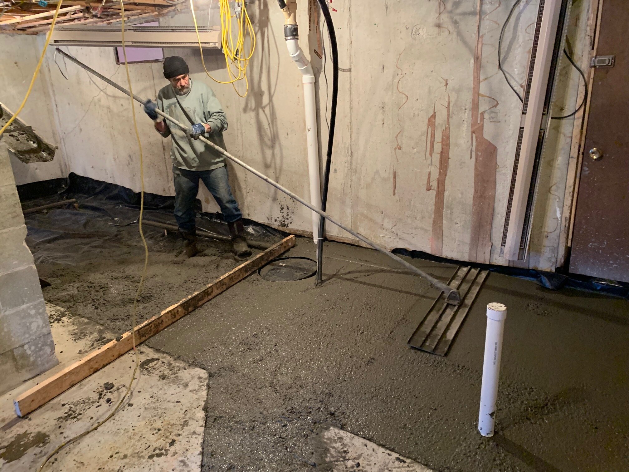
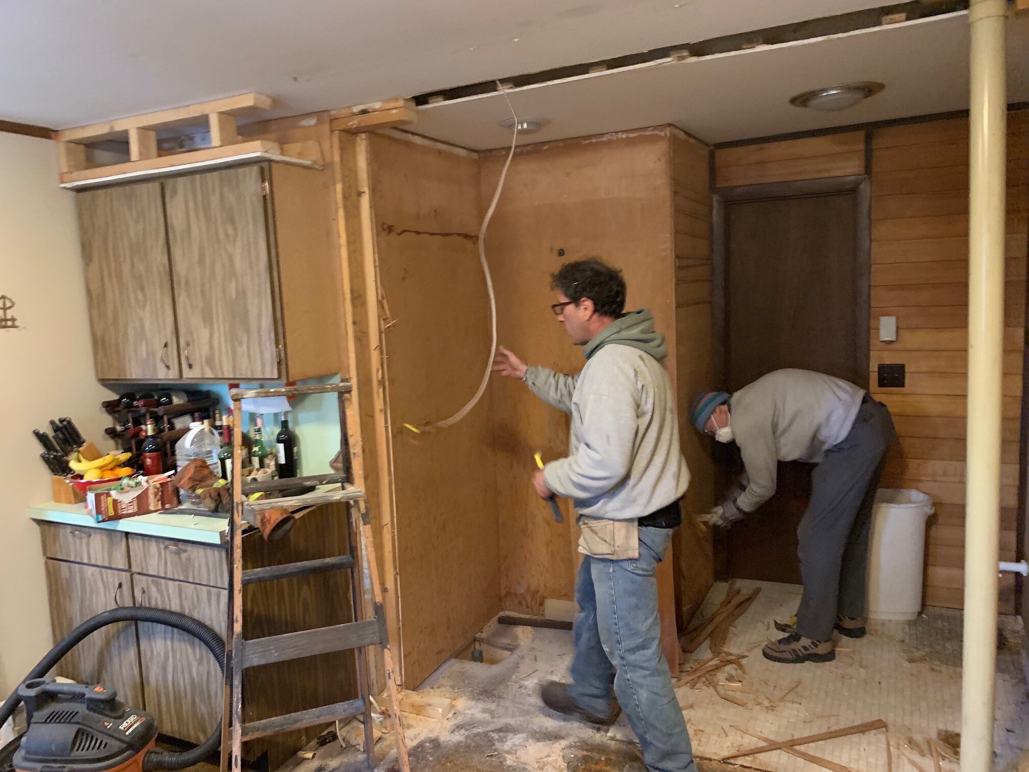
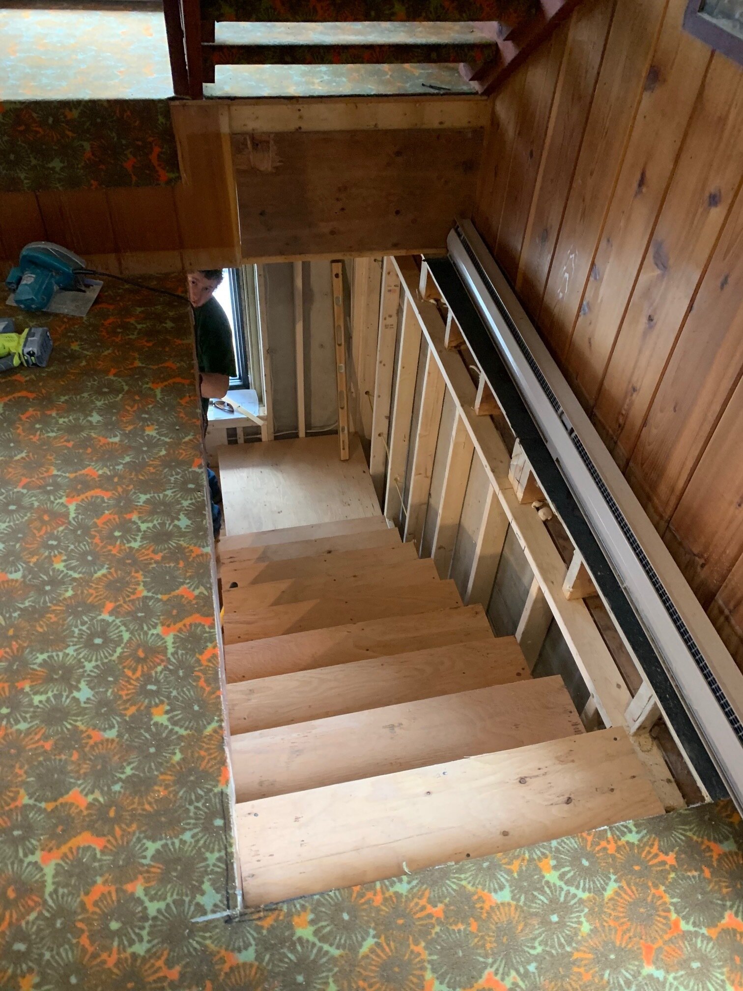
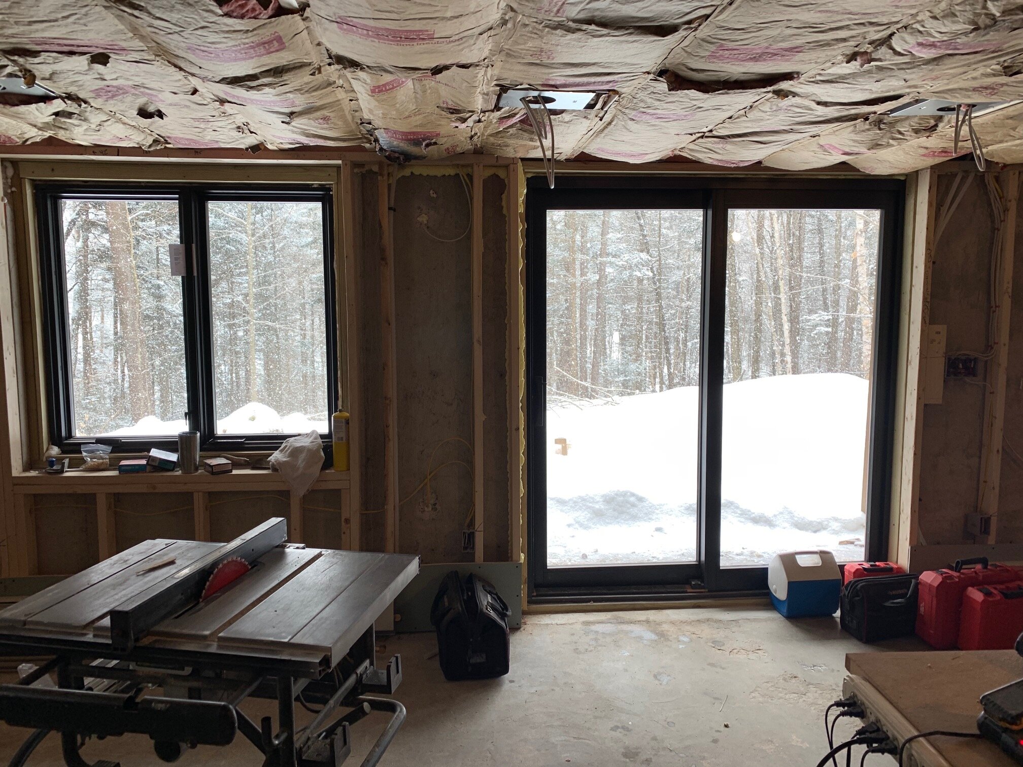
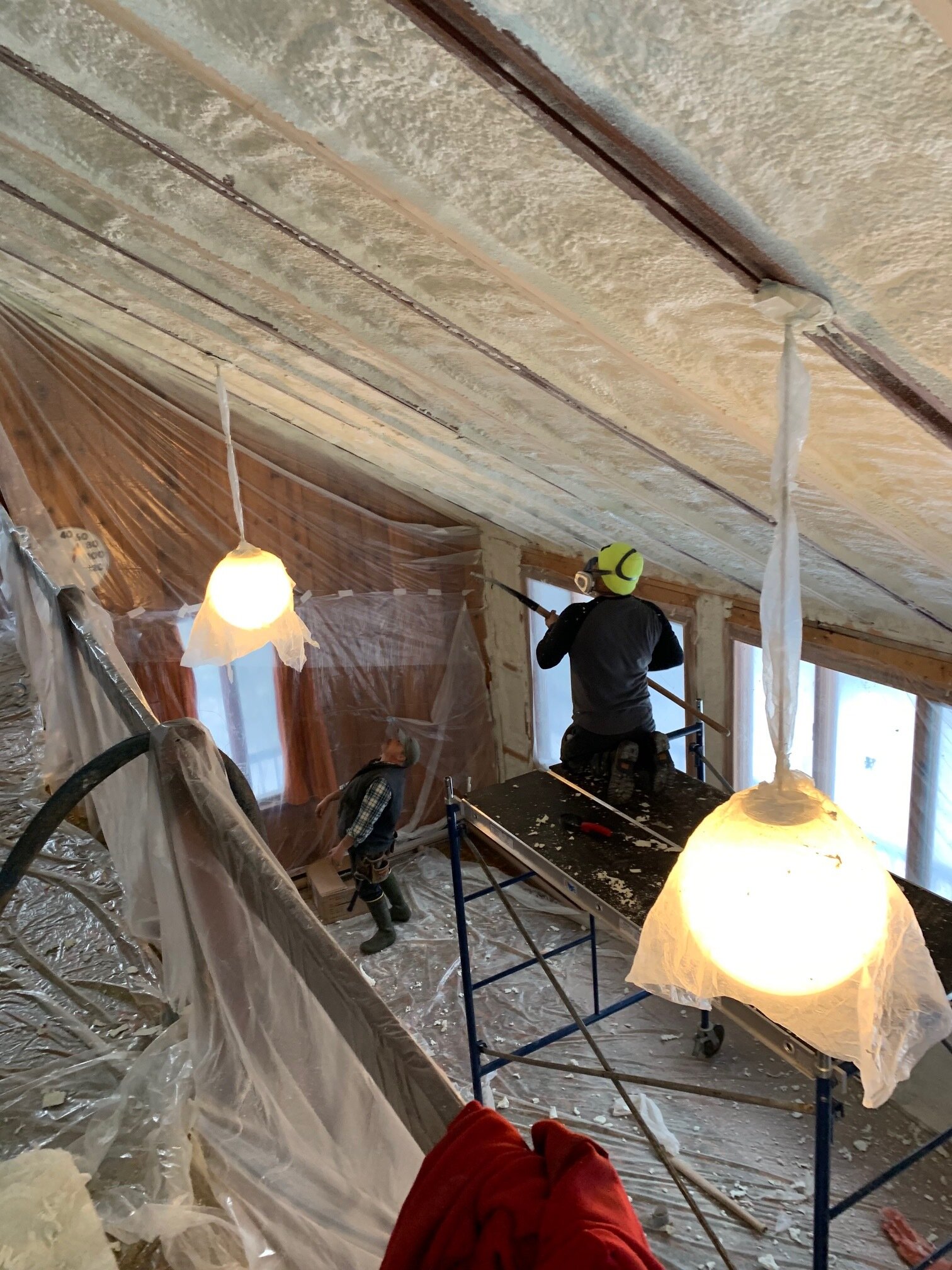
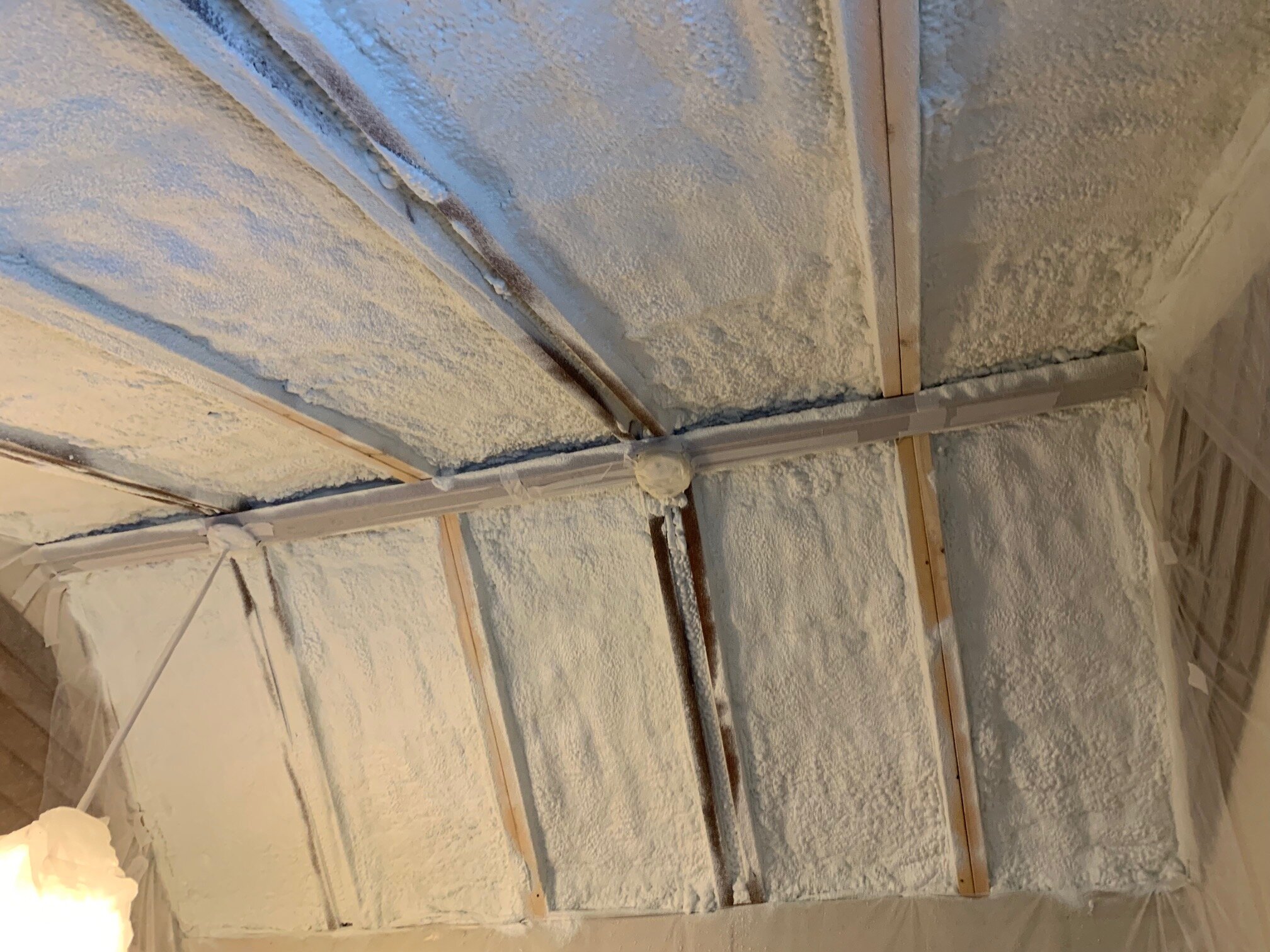
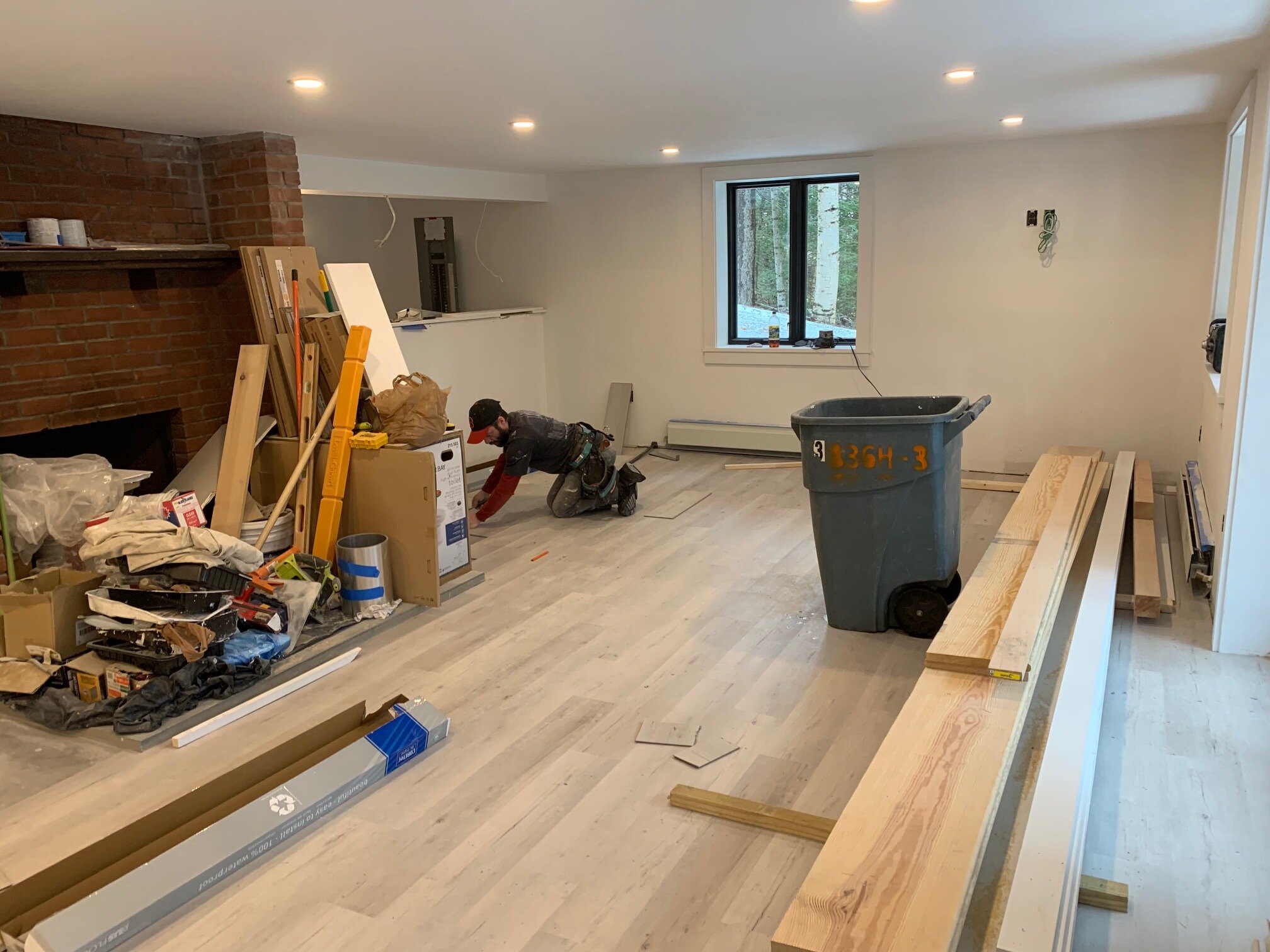
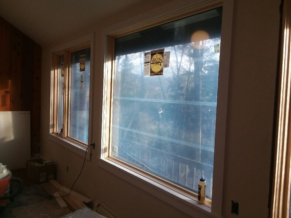
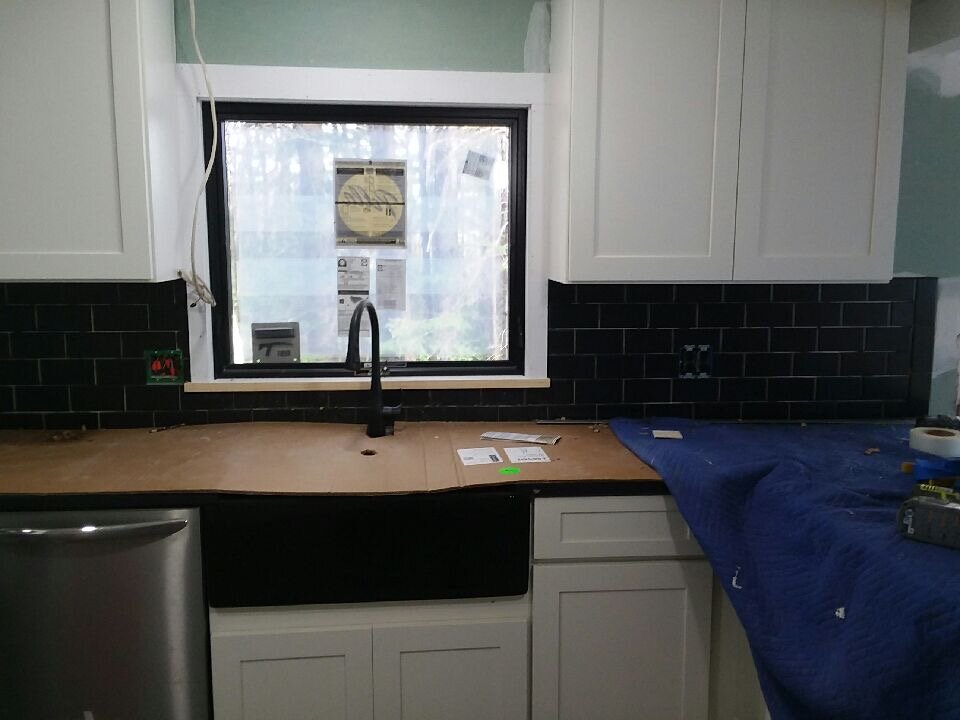
Construction included upgrading the entire envelope of the house with new high efficiency windows, doors, and close cell spray foam insulation. The heat source was converted from electricity to high efficiency propane appliances and utilities. The layout of the home was optimized by installing a beam and opening the kitchen to the dining/ living main cathedral hall of the home. A new stair accessing the basement was stacked below the stair leading to the upper level. Half of the concrete slab in the lower level needed to remove to provide for new plumbing to the wet bar and bathroom in the lower level. It turned out the concrete slab was 12” thick in some locations which required industrial grade hydraulic powered concrete sawing equipment to be used.
Design & Development Plan
Prior to the renovation a visit to the home was like traveling back in time. The previous owner had not used nor updated the home for the past forty years. The appliances, carpet and décor were something from a movie. The home was originally constructed as a two-family home with the lower level being severely damaged by hurricane Irene in 2011. The redevelopment plan entailed combining the two units into a larger single-family home. The efficient layout of the structure allowed for 4 bedrooms, 3 full bathrooms and plenty of common space.
The Finished Product
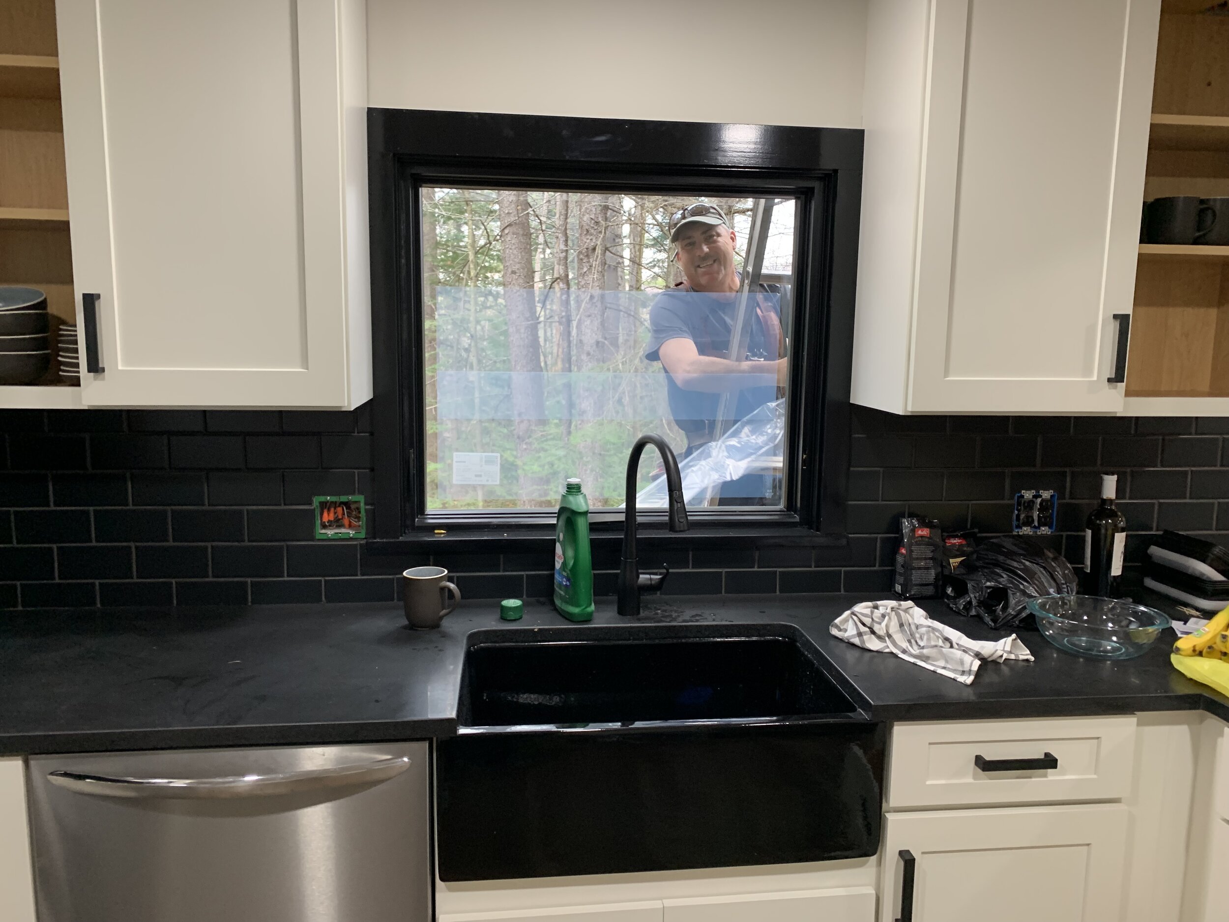
The efficient layout of the home allows for 4 bedrooms, 3 full bathrooms and plenty of common space. The envelope of the existing home was optimized while opening up the main living hall space to the newly upgraded contemporary kitchen. The lower level was converted into a game room/ wet-bar for entertaining. The home was entirely upgraded to a contemporary aesthetic while maintaining some of the retro flavor of the home, particularly the spherical lighting that was commonly seen in the architecture of the 1970’s.


